Grok Imagine Image 2.0 Preview
Rendering accurate text with Grok Image 2.0
Grok Imagine Image 2.0 can produce posters, labels, UI mockups, menu boards, and covers with readable text when the prompt gives exact wording, placement, hierarchy, and constraints.

Introduction
Text rendering is most reliable when the prompt treats words as part of the composition. Instead of asking for a vague poster or label, define the exact copy, type role, placement, and amount of supporting text.
The request
Start by deciding which words are mandatory. Then give Grok Image 2.0 enough layout direction to keep those words readable inside the final frame.
Exact wording
Quote the copy that must appear and ask for no extra text when the layout should stay controlled.
Placement
Describe where each text block belongs: top headline, centered badge, bottom caption, label, or sidebar.
Hierarchy
Separate headline, subtitle, body text, badges, and small labels so Grok Image 2.0 can rank visual importance.
A workflow for readable text
Text rendering is part copywriting and part layout direction. Grok Image 2.0 needs to know the exact words, but it also needs a simple design structure where those words have enough room to exist.
Keep the copy intentional
Text-heavy images fail when the prompt asks the model to invent too many words. Decide which words are mandatory, quote them exactly, and remove anything that does not need to be visible. A short headline and one supporting line are usually more reliable than a full paragraph.
Define the role of each text block
Treat every word as part of the layout. Say which text is the headline, subtitle, badge, product label, date line, menu heading, or button label. This helps Grok Image 2.0 understand size, position, and visual hierarchy instead of placing all text with the same importance.
Control the surrounding design
Readable text depends on contrast, spacing, background simplicity, and composition. Ask for clean negative space, high contrast type, simple backgrounds, and enough margin around the copy. If the image is busy, the model has less room to render letters cleanly.
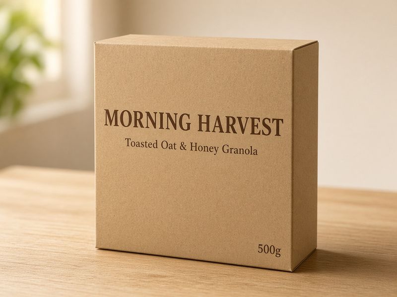
Quoting the exact text
If a word must appear in the image, quote it exactly. This reduces invented copy and helps the model treat text as a required visual element.
Prompt
"Create a minimal poster with the exact headline "MOON MARKET" in large uppercase letters. Add the smaller line "FRIDAY 8 PM" below it. No other text."
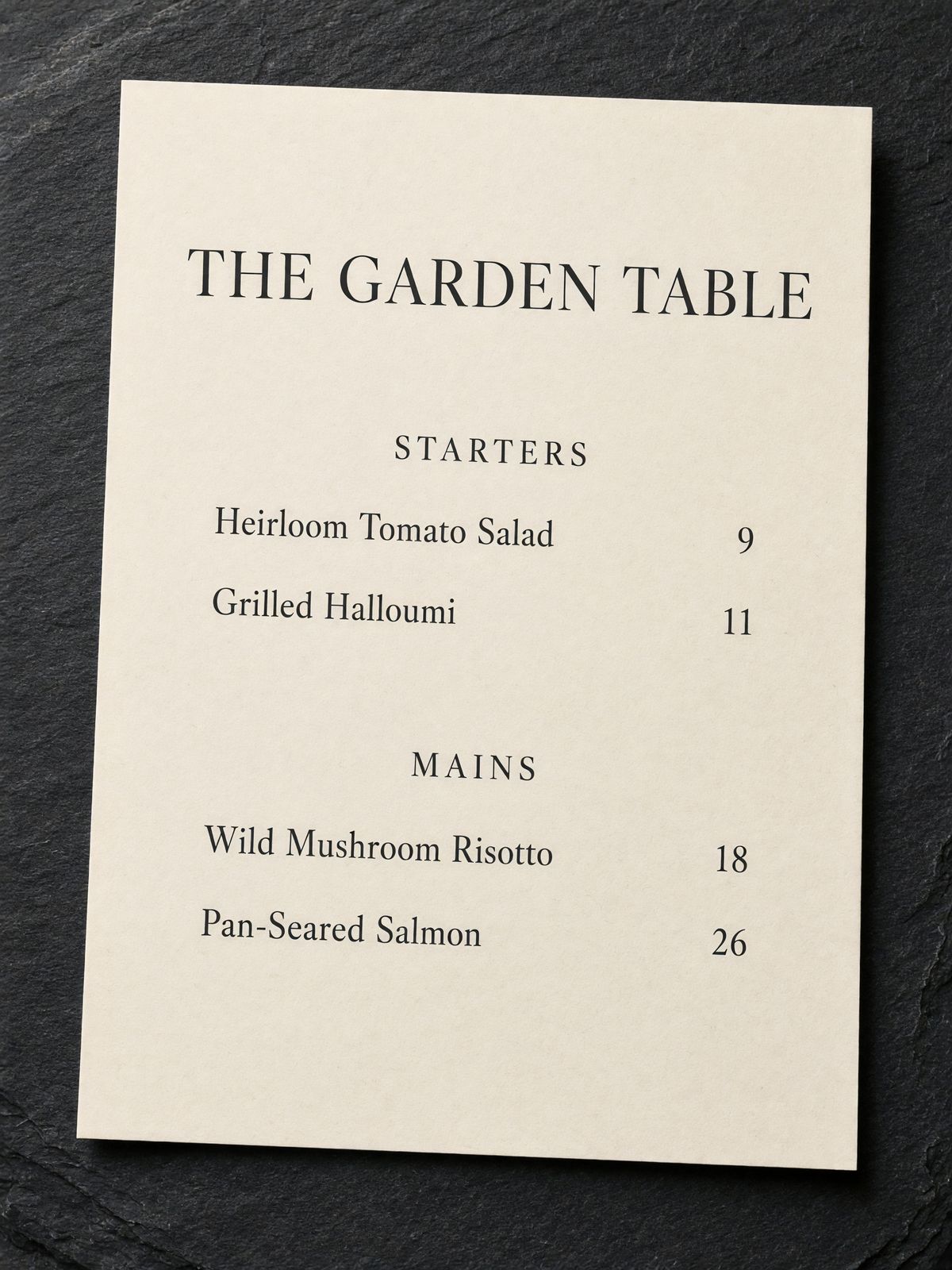
Typography, hierarchy, and layout
Text becomes more reliable when the prompt separates headline, subtitle, labels, badges, and supporting copy by size and location.
Prompt
"Design a clean editorial cover with the headline "FIELD NOTES" at the top, a small subtitle underneath, strong spacing, bold sans-serif type, and no extra words."
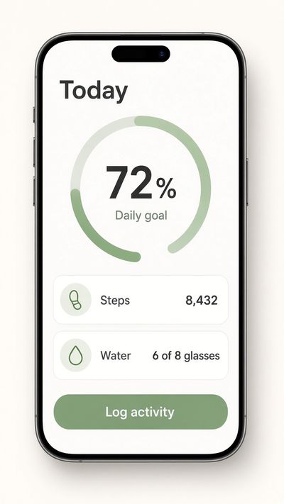
Small text and dense designs
Dense layouts need fewer words, stronger hierarchy, and clear zones. Keep small text short so the design stays readable.
Prompt
"Create a simple app dashboard mockup with three readable tabs: "Overview", "Reports", and "Settings". Use clean spacing, no tiny paragraphs, and no extra labels."
Best use cases for text rendering
Posters and covers
Use exact headlines, clear subtitle placement, and a small number of supporting details. For best results, specify whether the headline is centered, top aligned, oversized, stacked, or placed in a specific safe area of the frame.
Labels and packaging
Packaging prompts should protect brand names, product names, weights, flavor names, and label zones. Keep the copy short, avoid tiny legal text, and ask for straight, centered, readable typography on the surface.
UI mockups and dashboards
For interface images, request a limited number of tabs, cards, buttons, or headings. Use short labels and ask for clean alignment, consistent spacing, and no tiny body copy. The goal is a believable layout, not a complete production interface.
How to improve weak text results
If the image is attractive but the words are wrong, do not only regenerate the same prompt. Tighten the copy, simplify the layout, and make the text hierarchy more explicit before trying again.
Misspelled or extra words
Quote the exact text again and add a constraint such as no extra words, no invented labels, and no alternate spelling. Reduce the amount of required copy if the design contains several text blocks.
Text is too small
Ask for fewer words, larger type, stronger contrast, and more negative space. Small labels are harder to render than headline-sized copy, especially on vertical mobile layouts or dense posters.
Layout feels crowded
Split the idea into fewer visual zones. Remove decorative elements, reduce background detail, and tell Grok Image 2.0 which text block should be dominant. A simple layout usually produces more readable text.
Text rendering checklist
Before generating
Check whether every required word is quoted exactly, whether the headline is short enough, and whether the layout has enough empty space. If the prompt asks for a poster, label, UI, and menu at the same time, split the request into a simpler design.
After reviewing the image
Look for spelling, extra words, warped letters, awkward alignment, and text that blends into the background. If only one part is wrong, revise that part directly instead of rewriting the entire prompt.
When preparing production assets
Use generated text images as concept or draft assets unless every word has been reviewed. For brand, legal, medical, financial, or packaging work, verify the copy manually before publishing or handing the image to a client.
Text rendering FAQ
Can Grok Image 2.0 render long paragraphs?
Short copy is more reliable. Long paragraphs, dense menus, tiny chart labels, and legal-style packaging text are harder to render cleanly. For long-form information, generate the visual layout first and add final copy in a design tool.
Why does the model add extra words?
The prompt may be describing a visual category that normally contains more text, such as a poster, dashboard, or product label. Add a constraint like no extra text, only the quoted words, and keep all other design elements non-textual.
What helps text stay readable?
High contrast, large type, simple backgrounds, short phrases, and clear placement all help. Tell the model where the text goes, how large it should feel, and which words are most important in the hierarchy.
Advanced text rendering guidance
Design around the words first
When text must be accurate, the words should drive the design instead of being added at the end of the prompt. Start by deciding the exact headline, subtitle, label, or button text. Then describe the composition that gives those words enough space. A prompt that begins with a crowded scene and later asks for a readable headline gives the model a harder problem. A prompt that begins with a poster containing the exact headline, with a clean background and strong contrast, gives Grok Image 2.0 a layout that supports the text from the beginning.
Separate visual copy from decorative marks
Many designs include lines, icons, badges, shapes, and interface decorations that can accidentally turn into extra letters. If you only want three words, say that the design should contain only the quoted words and that all other decorative elements should be non-text shapes. This is especially useful for packaging, UI mockups, posters, and menu boards. It tells the model not to fill empty areas with fake labels, invented brand names, or unreadable microcopy.
Use hierarchy to reduce ambiguity
Hierarchy tells the model what the viewer should read first. A useful prompt might say: large headline at the top, small subtitle below, one badge in the lower right, no other text. This is clearer than asking for a beautiful poster with title and details. If you need multiple text blocks, name their roles and relative size. Headline, subtitle, date line, product label, tab label, and caption should not compete with each other. The clearer the hierarchy, the easier it is to judge whether the output succeeded.
Keep UI and dashboard text simple
Interface mockups often tempt people to ask for many tabs, charts, tables, filters, buttons, and paragraphs. That usually makes text less reliable. For a concept mockup, choose a few important labels and let the rest of the interface be represented by simple blocks, lines, icons, or charts without readable text. Ask for clean alignment, consistent spacing, and a limited set of quoted labels. This produces a believable UI image while avoiding dense areas of small distorted words.
Use image generation and design tools together
For final assets, Grok Image 2.0 can create the visual concept, composition, lighting, product scene, or poster direction, while a design tool can add final copy with full typographic control. This workflow is practical when the idea is visually strong but the copy must be exact for legal, brand, pricing, medical, or financial reasons. Generate the layout with short placeholder text or a simple headline, then replace or refine the copy manually when production accuracy matters.
Review text like a proofreader
Do not only glance at the image. Read every visible word, including small labels, badges, packaging details, and background signs. Check spelling, punctuation, capitalization, letter spacing, line breaks, and whether the text matches the prompt exactly. Also check whether the model added extra words you did not request. For SEO pages and product content, accurate alt text and visible text both affect user trust. A good text-rendering output should be visually strong and easy to proofread.
Production review checklist
Text rendering is easy to overestimate because the image may look polished at first glance. A proper review checks the copy as carefully as the composition. Before using a Grok Image 2.0 result in a page, ad, product mockup, or social creative, review both the visible words and the layout that supports them.
- Read every visible word slowly. Check headline text, subtitles, labels, badges, packaging copy, menu items, UI tabs, background signage, and any accidental small text the model may have added.
- Compare the image against the quoted prompt. If the prompt requested exact words, the result should match spelling, capitalization, punctuation, and word order. A visually attractive image with wrong copy is still a failed text-rendering result.
- Check contrast and size at the final display width. Text that looks readable on a large desktop preview may fail inside a small card, mobile viewport, social thumbnail, or compressed sharing image.
- Look for invented or semi-readable filler. AI-generated posters and interfaces may add fake microcopy, distorted labels, or pseudo-letters. Remove those by simplifying the prompt or asking for non-text decorative elements.
- Use a design tool for final copy when precision is mandatory. Grok Image 2.0 is useful for layouts, concepts, and readable short phrases, but compliance text, pricing, legal claims, medical copy, and brand slogans should be manually verified.
Final text rendering review
The final review should treat text as both design and information. The letters need to look good, but they also need to communicate the exact message. If a poster headline is almost right, if a product label has one wrong letter, or if a UI mockup invents extra navigation items, the result can confuse users. For that reason, every text-based image should be reviewed at full size and at the final size where it will appear.
For SEO content, image text and alt text should support each other. The visible image can show a short headline, label, or interface state, while the alt text should describe the actual scene in natural language. Do not rely on an image to carry important page information that should also be available as HTML text. Search engines and assistive technologies need readable page copy, not only pixels.
A reliable workflow is to generate the concept with short, quoted text, choose the strongest composition, then decide whether the visible words are accurate enough for the use case. If exact typography, legal copy, pricing, dates, or brand slogans are required, finish the asset in a design tool. Grok Image 2.0 can speed up ideation, but publication still benefits from human proofreading.
Tips
- Use short text strings for best readability.
- Quote exact copy with quotation marks.
- Tell the model not to add extra text, extra logos, or extra labels.
- Specify uppercase, lowercase, font weight, alignment, and spacing when they matter.
- For UI mockups, keep labels simple and avoid dense body copy.
Related guides
Continue with Grok Image 2.0
These pages are connected as one Grok Image 2.0 learning cluster. Use the main page for the core model overview, then move between the prompt, editing, and text rendering guides for deeper workflows.
Grok Image Prompts
Browse visual inspiration, copy a prompt, and customize portraits, product shots, anime, and illustrations.
Grok Image 2.0
Return to the main Grok Image 2.0 page for the full image model overview, features, examples, and creation workflow.
Grok Image 2.0 Prompting Guide
Learn how to structure text-to-image prompts, choose aspect ratios, direct the shot, and protect factual details.
Editing images with Grok Image 2.0
Use reference images for restyling, object removal, background replacement, relighting, and controlled visual edits.